
What if your engineering team could see a direct vision of the future?
Not a “choosing the winning lottery numbers” vision of the future.
Not a “time traveling version of yourself brings a sports almanac 60 years to the past to guide you to wealth via gambling until a meddling high schooler and a wild haired scientist in a Delorean show up to stop you” vision of the future.
But a vision of the future in which you know whether your team would meet their deadlines, and, if not, exactly when things are likely to begin careening off track.
Who or what is the prophet of this future, capable of providing you with such great knowledge? If the title of this post isn't already a complete giveaway, the answer is this:
Burndown charts.
Burndown charts are simplified visualizations of the many different moving pieces in your development process. They help you proactively identify issues with your workload, timeline planning, and productivity pipeline before you end up blowing a deadline. Or at least help you not blow the deadline too badly.
And Shortcut just released even nicer versions of the charts we already had in place. Read on to learn more about them.
<!-- Code for CTA component starts here-->
<div class="post_body_cta"><div class="post_body_cta-heading">
Give us a whirl
</div><div class="post_body_cta-text">
Because you shouldn't have to project manage your project management.
</div><div class="common_buttons_wrap"><a href="/signup" class="button primary text-color-white w-button">Get Started - free forever</a>
<a href="https://api.app.shortcut.com/oauth/signup" class="button is-google w-button">Sign up with Google</a></div></div>
<!-- Code for CTA component ends here-->
What is a burndown chart?
A burndown chart is a visual aid for tracking how much work is left on a project compared to the amount of time left before the deadline. It’s commonly used in scrum management to track productivity and efficiency, and, unlike so many other things involved in project management and life in general, is not all that easy to bloat. It is, after all, mostly just a line graph with some helpful colors added to it.
Burndown charts are great project management tools because they have the power to predict if your team is going to meet their deadline days or even weeks before that deadline arrives. And charts won’t just tell you whether you’re going to hit the deadline or not; they’ll give you a pretty good idea of why, too.
Burndown charts are a common tool in agile development for assessing team progress on a regular basis. Discrepancies in the burndown are an opportunity to drill down to find the root cause and fix it before it derails an entire sprint, or worse, a product release.
There are several different types of burndown charts:
- Sprint burndowns (at Shortcut, we call them Iteration burndowns because we like to be different) chart the amount of work remaining during a time-boxed period (typically two to four weeks).
- Epic burndowns are graphical representations of the amount of work remaining in that Epic.
- Product burndowns (at Shortcut, we call them Milestone burndowns, again, we're different) chart the amount of work remaining across a span of sprints (or Epics) to give an overview of the work remaining over a longer period of weeks or months.
- Label burndowns — at Shortcut, we also create burndowns that illustrate the remaining unfinished work within a Label.
Burndown Reports can be accessed within Epics, Iterations, and Milestones, as well as within the Reports section of your account where you can filter them by all the things mentioned in the first half of this sentence.
How to read a burndown chart
The real appeal of a burndown chart is that it’s simple. If you can read a basic line chart, then you can usually understand a burndown chart. If you can’t read a line chart, consider Googling “line charts” and then come back here after you’re done.
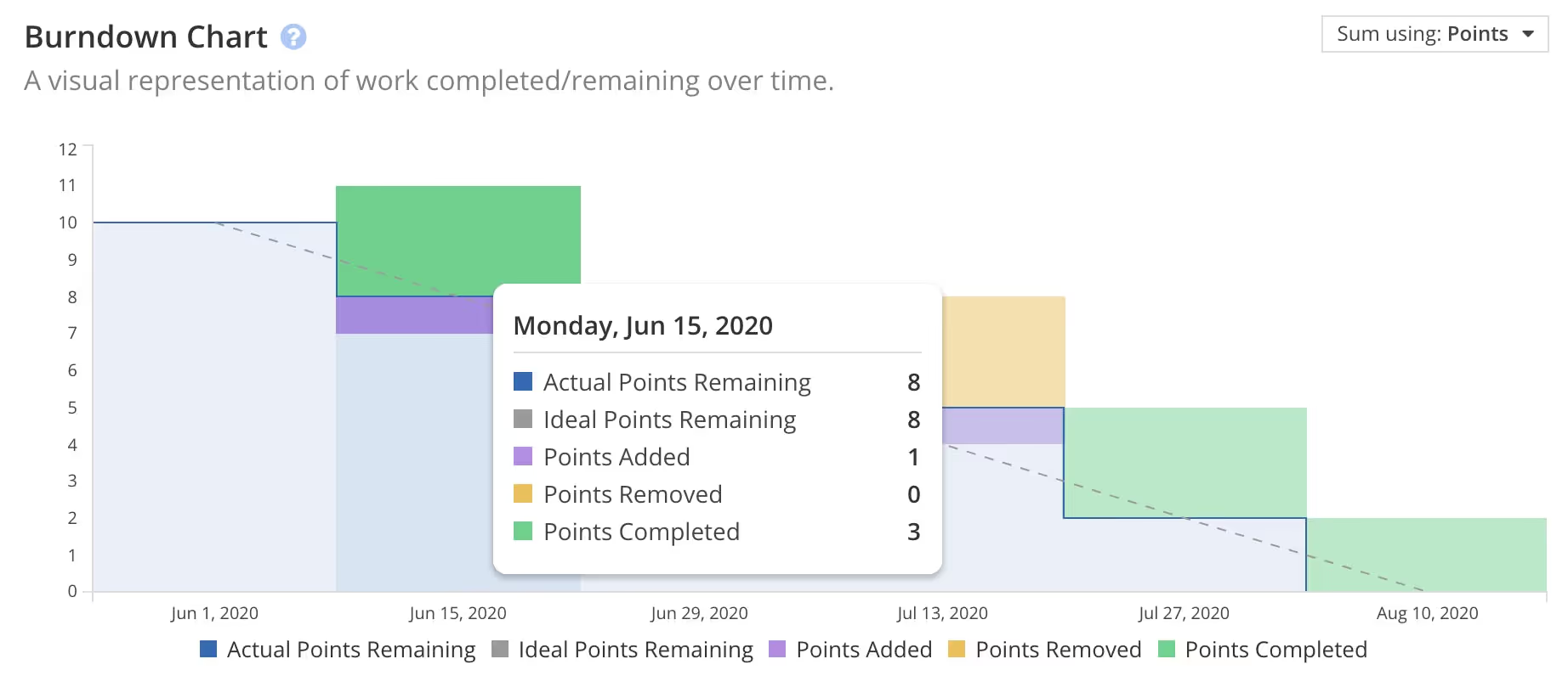
The chart is a graphical representation of the amount of work that still needs to be completed (the y-axis), charted against the amount of time remaining (the x-axis).
Each burndown chart displays two lines.
The Ideal Work or Points Remaining Line is the gold standard. If everything goes according to plan, your workflow would look like this. It’s typically a straight diagonal line from the top left to the bottom right, based on the assumption that you will complete work in equal chunks each day until you meet your goal.
The Actual Work or Points Remaining Line is where the real action is. This line charts how many story points (or action items) the team has left to complete in that sprint. Ideally, this line should also trend downwards at a steady rate, but that isn’t always the case (for reasons we’ll explain below).
The Burndown Chart will also show much new work was added to the Iteration on that day, and how much existing work was removed from the Iteration on that day. Stories added during the Iteration's time period will be represented by a purple bar along the Burndown Chart, while Stories that have been removed during the Iteration's time period will be represented by a yellow bar along the Burndown Chart.
Because a burndown chart tracks how much work is left to be completed, it should theoretically trend downward as you complete work on various stories and get closer to your goal. Hence, burndown. A burnup chart, by contrast, tracks the amount of work you’ve completed over time.
Benefits and Limitations of Burndown Charts
Burndown charts are useful for tracking the progress of a sprint, or an entire project, but they aren’t the be-all and end-all of project management by any means. Rather they are just one tool of many that can help guide you towards productivity.
Benefits. Burndown charts:
- Help set team expectations. Everyone knows exactly what work they need to complete before the deadline and can budget their time accordingly.
- Are easy to read and interpret. Burndowns can help you get an overview of project progress with just a glance.
- Are non-technical. Anyone can read and understand a burndown chart, which makes them an effective communication tool with management.
- Minimize risk. Burndowns help illuminate issues that are blocking progress before they become major problems.
- Manage scope creep. If your Actual Work Remaining Line starts creeping skyward, it’s a canary in the coal mine, pointing towards scope creep.
- Keep your team motivated. There is something inherently motivating about watching the amount of work to do creep towards zero.
Limitations. Burndown charts:
- Provide limited detail. Remember, we’re talking about two thin lines. Burndown charts only show part of the picture. They can give you a good idea of what’s going on, but you’ll still need to investigate the “why.”
- Rely on accurate planning. In order to create a useful Ideal Work Remaining Line, you need to accurately estimate how long it will take to complete a project or how much work can realistically be completed in a sprint. If you misjudge, your expectations will be misaligned with reality.
- Don’t work if not updated frequently. A burndown chart only works if it’s consistently updated with how much work is left to be done. At the end of this article, we’ll show you how to generate that information automatically to make your life way easier.
Burndown charts are great, but they’re not as powerful as sports almanacs from the future. Understand their limitations and use them wisely.
6 Reasons Your Burndown Chart Isn’t Linear
Ideally, the two lines on a burndown chart would be one and the same — you would complete work at the exact rate needed to easily reach your due date. But you are not a robot and projects aren’t perfect; in real life your team will face natural ups and downs in productivity.
That means variation is perfectly fine. While the goal is to keep the lines as close as possible to maintain a sustainable pace, most teams will fluctuate over and under as they work. But when things start to deviate a lot, you need to take a closer look at what’s going on to make sure there isn’t a larger problem.
Here are some of the major reasons your burndown chart might start to look funky:
1. The Obvious: You’re behind schedule

If your Actual Work Remaining Line is trending above your Ideal Work Remaining Line, that means you’re falling behind. At your current pace, you are unlikely to complete all of your stories by the established due date.
This might be because you’ve added more stories to your workload than your team has time to complete, or you may have overestimated your team’s abilities or capacity. It could also mean someone on the team isn’t pulling their weight, but let's assume the best and say that everyone just bit off slightly more than they can chew.
2. The Probably Good: You’re ahead of schedule

If your Actual Work Line is trending below the Ideal Work Line, that means you’re ahead of schedule.
Before you get too excited, be sure to take a closer look. If you’re consistently ahead of schedule, it might mean you’ve over-budgeted your time and haven’t added enough stories into this sprint. Basically, you’re not being as productive as you could be. It might also mean your team is overworking themselves and at risk of burning out, so better check in and make sure everyone’s doing okay.
But also, maybe you're just doing a good job. Not everything needs to be constantly optimized for perfection.
3. The Oops: You’re not updating your chart correctly

A burndown chart only works if the scrum master or product owner updates it on a daily basis. Failure to do so will lead to a chart that flatlines. Without anyone recording progress, the chart is stuck with a large amount of work to be completed stretching out over time. You may be working productively, but it’s not being recorded, making your chart useless.
Note that we automatically update your burndown chart in Shortcut. You can us your automated scrum master. That means this is unlikely to happen in Shortcut.
4. The Too Simplistic: You’re tracking the number of stories
Stories can require different amounts of effort to complete — some are big, involved tasks, whereas others might be smaller and easier to tick off. This results in an uneven progression — it might take three days just to accomplish one more difficult story, then you might complete four easier stories in a single day! If you’re updating your progress based on the number of stories to be completed, then your Actual Work to Be Complete Line will look like very uneven stairs.
Tracking progression this way is discouraged by expert scrum masters because it provides an inaccurate picture of how much work has been done and how much still needs to be done.
5. The Might Need More Context: You’re tracking remaining size

Most advanced agile teams measure progress based on the remaining size of the work that still needs to be done. They track the size of the remaining progress on all stories in the backlog, using story points. Because each story isn’t marked as completed until all tasks inside of it are done, it may look like no progress is being made for long stretches of time. The result is a line that looks like stairs with long plateaus in between each step down. Each long horizontal stretch represents ongoing efforts in not-yet-completed stories.
6. The Making Things Up as We Go: New stories are being added mid-sprint
Sometimes new requests or stories are added to the overall task list in the middle of a sprint. This causes the Actual Work Remaining Line to drift upwards, as there is now more work that needs to be completed before the deadline.
If new work is continuously added, the line will keep creeping upward instead of downward. It's like gravity, except in reverse. This is a warning that scope creep is overtaking your project, a warning that could probably heeded for virtually every project ever undertaken by a tech company. It might be time to reassess your plans.
We didn't generate a graph for this so as not to stress you out.
Imperfection doesn’t mean you’re doing it wrong
There is one surefire way to maintain a perfect-looking burndown chart: track your progress in terms of the hours your team has spent working. Teams carefully track the amount of time they’ve spent and the amount of time they have remaining and chart it. This makes for a pretty graph, but it doesn’t provide a clear picture of the work being done. After all, your team’s job is to complete tasks, not just wile away the hours looking busy.
The Ideal Work Remaining Line is just that, an ideal. Use it as a guide to make sure your work is trending in the right direction, but don’t get too hung up on aesthetics.
Create the most effective burndown charts with the least effort
Burndown charts only work if you keep them consistently updated. You need to know exactly how far along each team member is in completing their work at any given time, and you need to compile that and plot it each day.
That’s a lot of information that is way too difficult to track by hand. The easiest way to do this is by using a project management software that automatically generates burndown charts for you. Shortcut can do this for you so that you can focus on identifying blockers to productivity, instead of updating charts. Good old Shortcut. Wonder what else they can do?
Only one way to find out.
Enjoy your work
<!-- Code for CTA component starts here-->
<div class="post_body_cta"><div class="post_body_cta-heading">
Enjoy your work
</div><div class="post_body_cta-text">
Project management software should be helpful, not a hassle.
</div><div class="common_buttons_wrap"><a href="/signup" class="button primary text-color-white w-button">Get Started - free forever</a>
<a href="https://api.app.shortcut.com/oauth/signup" class="button is-google w-button">Sign up with Google</a></div></div>
<!-- Code for CTA component ends here-->

%20(788%20x%20492%20px)%20(1).png)
.png)