


Shortcut is all about making work easier—so our brand should feel just as effortless. Late last year, we set out to refresh our look, not just for the sake of change, but to better reflect who we are and where we’re going. We wanted Shortcut to feel as modern, fast, and intuitive as the teams who rely on it every day.
As we looked toward the future, we honed in on what truly makes Shortcut great:
- We're building a faster, more intuitive Shortcut. We’re continuously evolving to be the best tool for engineering and product teams—one that enables seamless collaboration and adapts to their needs.
- Obsessing over quality. Improving reliability, performance, and user experience in every aspect of Shortcut.
- Helping teams move faster and work smarter. By engaging more with customers, testing ideas early, and letting their feedback shape our evolution, we ensure Shortcut stays intuitive and effective.
This led to a brand reset—a fresh identity and website that better embodies our values and leaves a lasting first impression. Today, we’re happy to share what we’ve been cooking up with everyone!
Going Back to Our Roots

As Shortcut evolved into a fast, powerful, and intuitive tool, our brand needed to evolve with it.
- Evolving with Our Product: As Shortcut became faster and more intuitive, our brand needed to better reflect that speed and simplicity.
- Standing Out in a Crowded Space: We wanted a bold, memorable identity that clearly represented our values.
- Refining Our Story: Our messaging needed to be as intuitive and engaging as the product itself—straightforward, purposeful, and clear.
So, we took a step back and focused on what mattered:
✅ Aligning with Our Values – A brand that embodies simplicity, collaboration, and productivity.
✅ Making a Stronger First Impression – A refreshed identity that feels modern, approachable, and instantly recognizable.
✅ Resonating with New Users – Clearly showcasing the value of Shortcut and what teams can achieve with it.
✅ Boosting Memorability – A distinctive, lasting presence that sets us apart.
This rebrand wasn’t just about aesthetics, it was about ensuring Shortcut looks, feels, and communicates as seamlessly as it works.
Bringing the new Shortcut Brand to Life

We built our new brand around the following key principles:
- Be Human: We wanted a brand that feels approachable and unique, reflecting our connection with our customers.
- Simplicity: A clean, intuitive interface that makes navigation effortless.
- Detail-Oriented Visual Design: Letting visuals speak for themselves with minimal but impactful words.
- Concise Copywriting: Delivering clear, to-the-point messaging that highlights value without overwhelming users.
Additionally, we developed comprehensive brand guidelines to ensure consistency across all touchpoints. From visual elements to tone of voice, these guidelines ensure that Shortcut is represented consistently and cohesively.
Our Core Brand Values

At the heart of Shortcut, our brand values guide everything we do:
- Simplicity: We make complex workflows easier, reducing friction so teams can focus on progress.
- Productivity: Getting things done is our priority. We empower teams to move fast and deliver results.
- Respect & Empathy: We build with people in mind, from our customers to our internal team.
- Collaboration: The best work happens when teams are aligned, communicate effectively, and stay in sync.
- Fun & Delight: Work shouldn’t feel like a chore—we add moments of joy and personality to the experience.
- Smart & Helpful: Anticipating user needs and building features that add meaningful value.
The Process: From Concept to Execution
We started concepting and workshopping what the future would look like, refining our brand to reflect that vision.
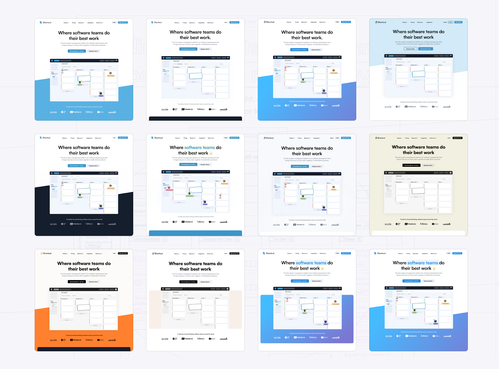
- Exploring a range of different colors and styles. We experimented with a variety of brand directions to see what resonated most with our vision.
- Evolving a classic Shortcut color. We honed in on a color palette that long-time customers would recognize, elevating our original brand colors with a more inviting purple that brings joy, improves contrast and readability while also modernizing the brand for the future.
- A/B testing different colors and concepts. We ran iterative tests to gauge how various elements impacted perception, usability, and brand recognition.
- Redefining the Shortcut identity. We stripped back what no longer served us and crafted a new, simplified vision for our future.
After rounds of iteration, we landed on a refreshed brand that blends familiarity with modernity—one that feels both classic and forward-thinking.
The New Shortcut
After lots of design exploration and iteration, we’re proud to introduce a brand identity that truly represents Shortcut’s vision and values. It’s a brand that not only aligns with our past but also sets the foundation for the future.

With this rebrand, we’re doubling down on what makes Shortcut unique: building a product that helps teams collaborate efficiently while keeping things simple and intuitive.
This is just the beginning. We’re thinking deeply about how to make our app even faster, more detail-oriented, and aligned with our simple and joyful brand. Our goal is to ensure that our customers love every part of using Shortcut. We can’t wait for you to experience the new Shortcut, explore the fresh design, and see where we go next!
👉Be sure to check out our updated branding page for a deeper dive (or right-click on our logo for quick access).
If you’re looking for a project management tool that’s built for speed and simplicity, give it a try with our 14-day free trial. 🚀


