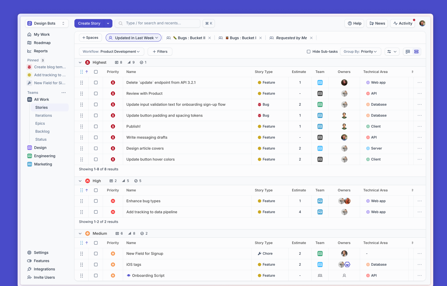
Like any product in active development, Shortcut has been adding features at a steady clip since we launched last year. We’ve shipped several large features like Milestones and Reports, and hundreds of smaller features that add up to an improved user experience and an improved product.
One of the challenges of an expanding feature set is that it can create structural problems that a design wasn’t originally built to solve. At some point, the design needs to be revised so it can support all existing requirements, and provide a stable foundation for future changes.
On the other hand, changing a design can be risky — especially when it’s already in the hands of your users. Modifying one element might lead to modifying another group of elements to keep things cohesive, users are sensitive enough that even a minor change can disrupt their workflow, and rolling out changes too frequently can cause users to develop a frustration with the product that is difficult to shake.
If there’s one thing people hate, it’s having to get used to something new when they already learned how to use the old version.
So why did we redesign the Story view, one of the core UI elements in Shortcut? There are a number of reasons, but a screenshot comparison might explain it best:

By popular demand, Story owners are now represented as avatars instead of as initials. It’s a little less compact, but avatars are much easier to differentiate at a glance, and it’s now consistent with how we display owners of Tasks and Epics.
We’ve also created a general-purpose “badge” component that we’re using to describe things like blocked relationships, estimates, due dates and labels in a visually cohesive way. In the original design, each type of data had a slightly different visual treatment, since many of those types were added at different points in time.
The sum of these changes are that Stories are now more scannable and visually cohesive. We believe that after using the new design for a couple of days, you’ll cringe if you see the old design (which is incidentally a good litmus test for how well a new design is working).
The CSS & Data Behind the Design
While most of the front-end development was straightforward, one aspect of the new layout proved to be a little tricky: allowing badges to be aligned bottom-left, and avatars bottom-right, while allowing both to share the same space efficiently.
I won’t explain the solution in this post, but here is a simplified version on CodePen that demonstrates how the layout handles the different cases that come up.
This layout handles most cases pretty well. The one exception is the last case in the screenshot above, where the users overflow to two lines and become left-aligned, which can happen if a Story has six or more owners. As part of the design process, we looked at the data and found that 99.98% of all Stories have less than six owners, leaving only 0.02% of all Stories that wrap. Given that, this rendering flaw is not a big deal.

The distribution of all Stories by owner count in Shortcut. Stories with 12 owners actually do exist!
That is why it’s worth looking at actual data when making design decisions: not to let the data make decisions for you (as you might with an A/B test), but to validate and challenge the natural intuition you rely on as a designer.
If you have any feedback or thoughts about the changes we’ve made, we’d love to hear it — just email us at support@clubhouse.io. (And if any of the above is interesting to you, we’re hiring.)


%20(788%20x%20492%20px)%20(1).png)
.png)

